Architecturally speaking: BEO Mall
Atterbury Europe’s BEO Mall has made a big impact in Belgrade even during the current pandemic conditions, thanks in part to the innovative architecture and space planning, which was a collaborative effort from various parties. In the first of a two-part series on BEO Mall’s design, we learn about the process from Andrew Mackay from the Düsseldorf, Germany-based firm Chapman Taylor, who played an important role to mastermind the original design concept.
“Chapman Taylor or CT as they are known in the industry, participated in a competition process where a selected panel of architects were tasked to sell their views and ideas to the client. And BEO surely speaks for itself as to why CT was selected!” says Roux Gerber, Head of Development for Atterbury Europe.
When it comes to shopping centre design, what are today’s top priorities from an architectural point of view? Is there such a thing as a European architectural aesthetic for 2021?
There is a strong focus on design and function with the increasing inclusion of shared public spaces. Creating great retail destinations has never been more complex with many very different factors involved. Retail is no longer “the” anchor in the traditional sense; what is required is a vibrant “place to be” with a mix of retail, food and beverage providers and entertainment; plus sometimes other uses such as offices, hospitality, transportation, culture and more, subject to the location.
A successful shopping centre needs to be a genuine, high-quality environment where people want to be, meet friends, socialise, shop and be entertained. Quality, identity and public space are integrally connected; that is what attracts people, or customers.
European history dates back hundreds of years and is very rich and colourful. This is also reflected in its architectural legacy and that is what makes travelling across Europe so enjoyable. When talking about common European aesthetics we need to refer to the three main principles of architecture as defined by the Roman architect Vitruvius – firmitas (solidity), utilitas (functionality) and venustas (beauty). All three categories have the same value and need to be in balance.
There are differences between individual countries due to culture and climate, but the bottom line is that people nowadays are asking for the same things when it comes to retail – a mixed, safe, friendly, comfortable, well-designed environment.
Did the location in Belgrade present any considerations for you as architects? How did the climate in Serbia, for instance, impact on your design considerations?
The location and climate were indeed key starting points. The first time we visited the site and explored the surrounding areas, which are densely populated, it was clear that there was a lack of basic civic amenities, such as public spaces and parks, where people could meet and socialise. We saw that BEO offered a unique opportunity to be more than just a shopping centre, but also the heart of the community.
Serbians are incredibly social and enjoy meeting outdoors in large groups. They also have a great climate which facilitates this, but very rarely is the Serbian enjoyment of outdoor socialising reflected in the design of the public realm.
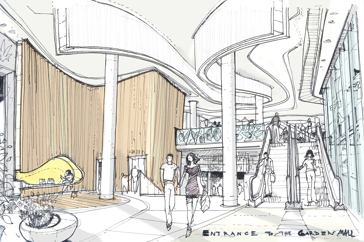
The first and most important public offering comes at the main entrance, with its landscape of steps, terraces, seating and greenery. Although steps are sometimes seen as a barrier, we used them to create a very welcoming public gesture and a natural meeting place for the local community. The steps are oriented south-west, and people can enjoy sunlight filtered through surrounding trees virtually the whole day.
Inside the centre itself, we wanted to create opportunities for people to enjoy the outdoors, but without having to leave the centre. On the top level, the food court opens to a terrace and roof garden.
Large skylights facilitate a connection to the outdoors. No matter where you are, you are aware of the weather conditions.
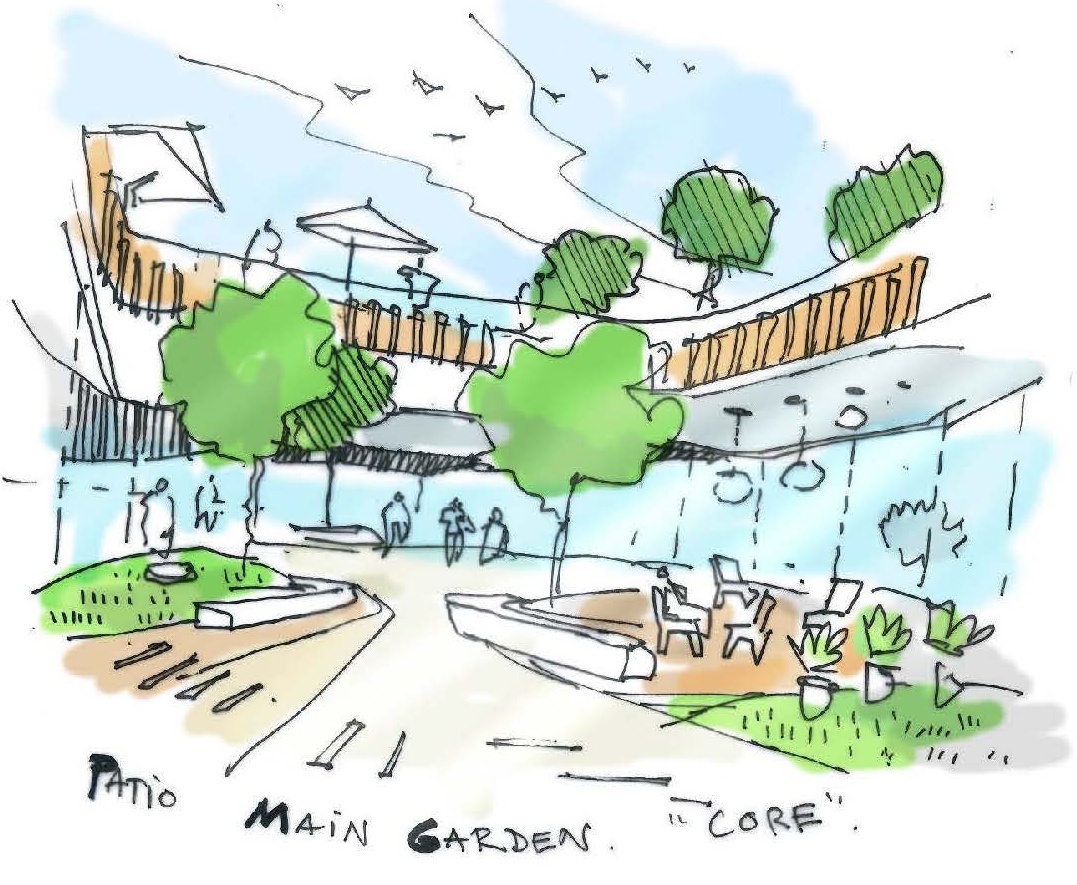
Early concept sketch of the food court roof garden
We see lots of open space and greenery at BEO Mall… what was the inspiration for the design?
The answer to this also relates to the previous question. As we saw BEO at the heart of the local community, it was important to provide spaces where people could linger and engage in a range of activities, not just shopping, but also eating, drinking, being entertained, or just hanging out. A lot of thought was put into these spaces, so they weren’t simply large holes cut through floor slabs with a glass roof over, but sculptured spaces, with shifting vertical lines and projecting balconies flanked by a range of offerings to create life and activity.
Escalators are never placed simply above each other, but criss-cross at different angles, so that the vertical journey through the open spaces becomes part of the theatre.
The open spaces were also necessitated by the long site geometry. The three main spaces punctuate the long racetrack mall system, providing spatial interest and variety along the customer journey.
Greenery, in combination with natural light, supports the idea of the mall being a meeting place at the heart of the community
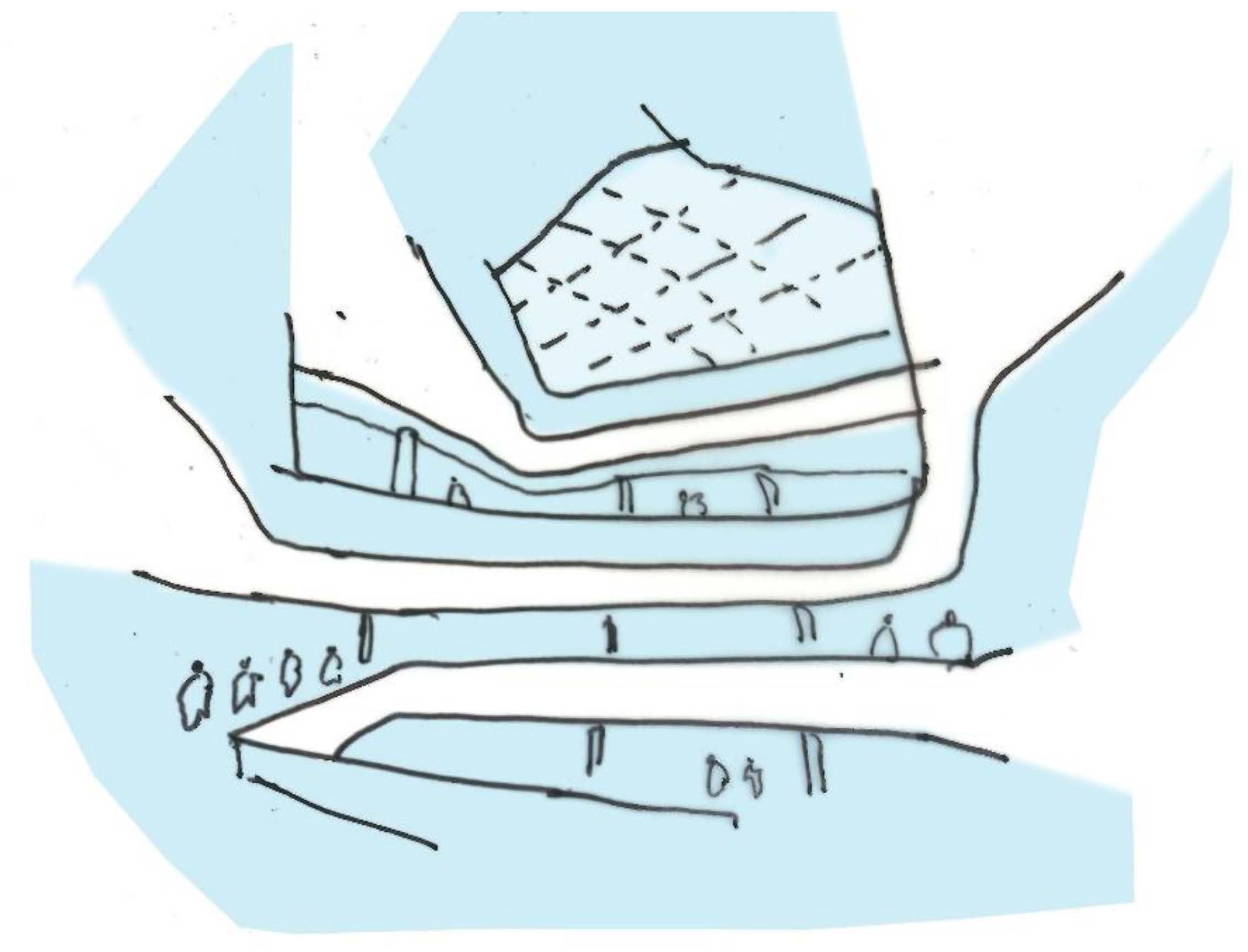
Early conceptual sketch of the central space
Early on we explored a number of theming options, one of them being “Denkova Basta”, or “Denkova’s Garden”, a reference to local history. Another idea was “Šumice”, the name of the local area, which literally means “small forest”. In fact, early on we did have an outdoor garden on the first floor. Although it was not realised, greenery remained an important theme for the mall design.
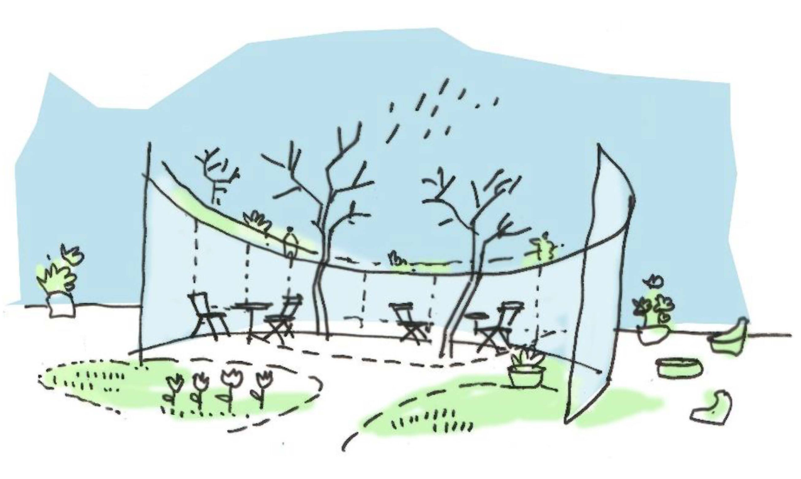
Early concept sketch reflecting the theme of “Denkova’s Garden”
Were there any standout challenges with the design of BEO Mall?
We believe that embracing challenges and working creatively to resolve limitations, difficulties or restrictions is at the core of architecture.
The site geometry and terrain – being very long, narrow and with a considerable slope from one end to the other – presented a number of challenges. However, with any challenge comes opportunities, and in BEO we used the height difference to create an upper and lower ground floor with street entrances. The main entrance could not be placed directly at street level, so we designed the stepped landscape mentioned above, which has become a lively public space in itself.
The length of the site necessitated very long malls, which could have appeared monotonous, but we worked hard to create spatial variety through subtle shifts and offsets in the line of shopfronts and voids, demonstrating that linearity need not necessary appear linear.

Mall layout
What would you describe as the highlights of the mall, in terms of design concept?
The highlight has to be the spatial quality described above. We succeeded in creating a very efficient layout which responds to commercial and leasing requirements, while at the same time offering an ever-changing spatial experience and interest at every turn and change of perspective. Another highlight has to be the sustained quality and variety of the interior design. There are many creative heads and hands at work here, not just our own. Local design students, for instance, were invited to provide designs for the treatment of plasterboard surfaces. Thought has been put into the treatment of every surface and detail.
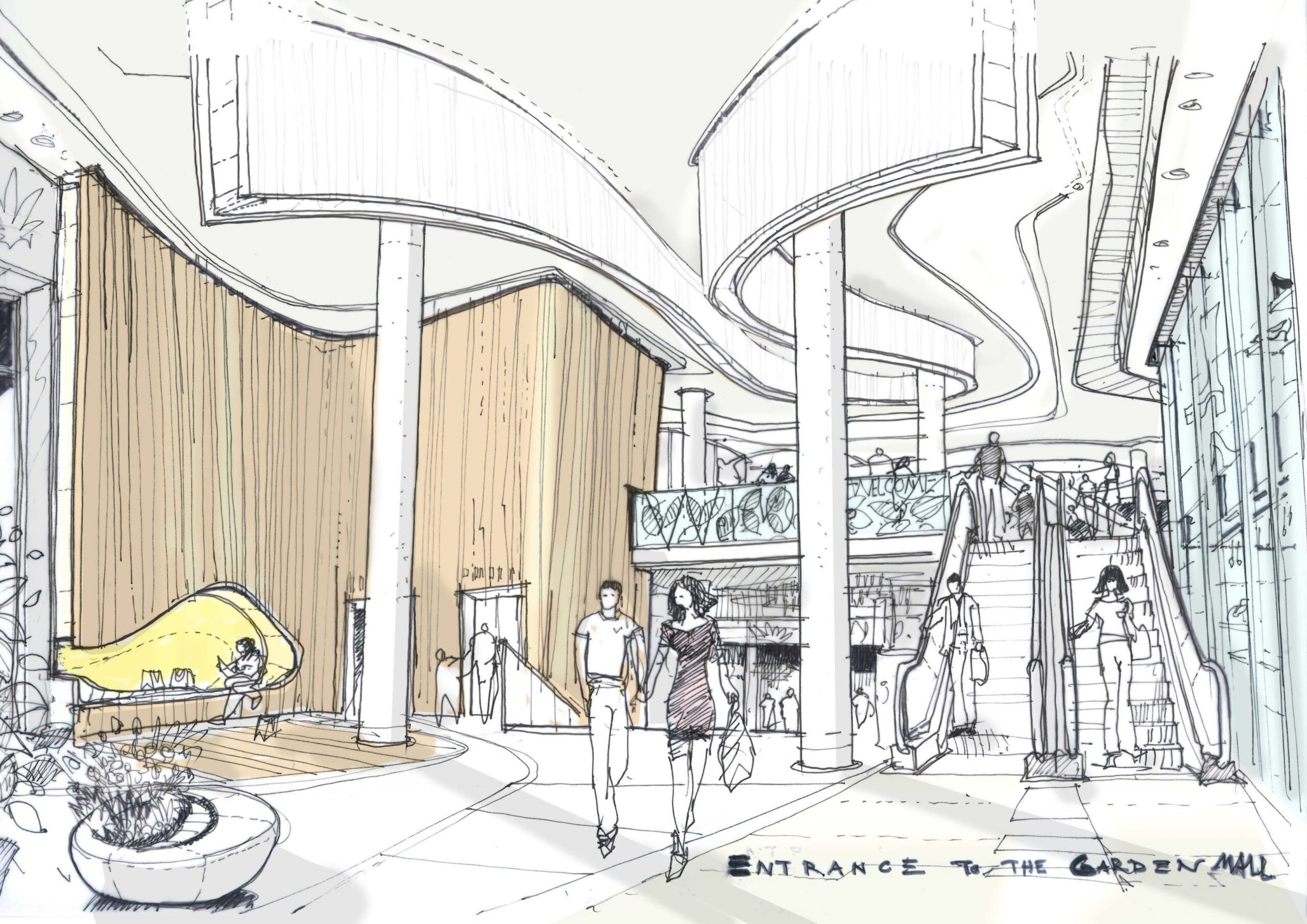
Initial concept for design of the second entrance
The Covid-19 pandemic has brought about many enforced changes in the way we shop, enjoy leisure activities and more. Do you think architecturally we will see this “new normal” reflected in design of public spaces going forward; and is this something you as a firm are grappling with?
Internet sales are rising, shopping centres are struggling, a bigger food and beverage offer is required as are meeting points, touch points, lounge areas, and much more – nothing really new there. People still need a “place” to go to and shopping centres seem to have a bigger and different role to play in the future. The pandemic has accelerated the necessity for change but so far it has not changed the way we design buildings and public spaces.
Prediction is always difficult, especially if it is about the future – an old saying but it has probably never been more true than today. In western Europe the demand for bricks-and-mortar retail space is declining; the focus has shifted from new build to remodelling and modernisation of existing centres to ensure that they keep pace with the latest trends and meet the aspirations of today’s customers.
We are also increasingly looking at changing retail space into hospitality, offices, student accommodation, and more, to give them a new lease of life.

