Inside BEO Mall – an architect’s view
The award-winning BEO Mall in the Serbian capital of Belgrade is the result of many different talents from all over Europe collaborating under Atterbury Europe’s leadership. Two different architectural firms contributed their expertise: Chapman Taylor focusing on the exterior and TT Design on the interior design. In this final installment of our series on BEO Mall’s design, Harry Vroemen from TT Design in the Netherlands explains their inspiration.
“There was a need expressed by the stakeholders of BEO Mall to bring more light and greenery into the interior design of BEO, and TT Design rose to the occasion with flying colours,” says Roux Gerber, Head of Developments for Atterbury Europe.
When it comes to shopping centre design, what do you consider today’s top priorities from an architectural point of view?
The top priority is that we create an environment that people will enjoy. We create interior places where people want to be. People visit the mall because they want to enjoy life with friends and family. Next to that activity there is the possibility to do your daily shopping or your fun shopping when the online service is not satisfying. Of course, all the functionalities in the mall need to be right and in place.
Are you of the opinion that there is such a thing as a European architectural aesthetic for 2021?
I do not think so. Every site or location is different and asks for custom-made solutions, from the layout of the retail scheme to the architecture. For a few years now, the trend in interior design has been to create a more sophisticated and intimate interior with a lot of attention to detail and material applications that can stand the test of time. It is all about meeting the expectations of the visitors.
Can you share your design inspiration for BEO Mall?
We as architects believe that we have to create/advance the spaces that facilitate the needs of the visitors. Gathering is one of these needs. That is why we introduced a lot of different spaces. The best thing that can happen is when the visitors take over the space and claim it as “their place”.
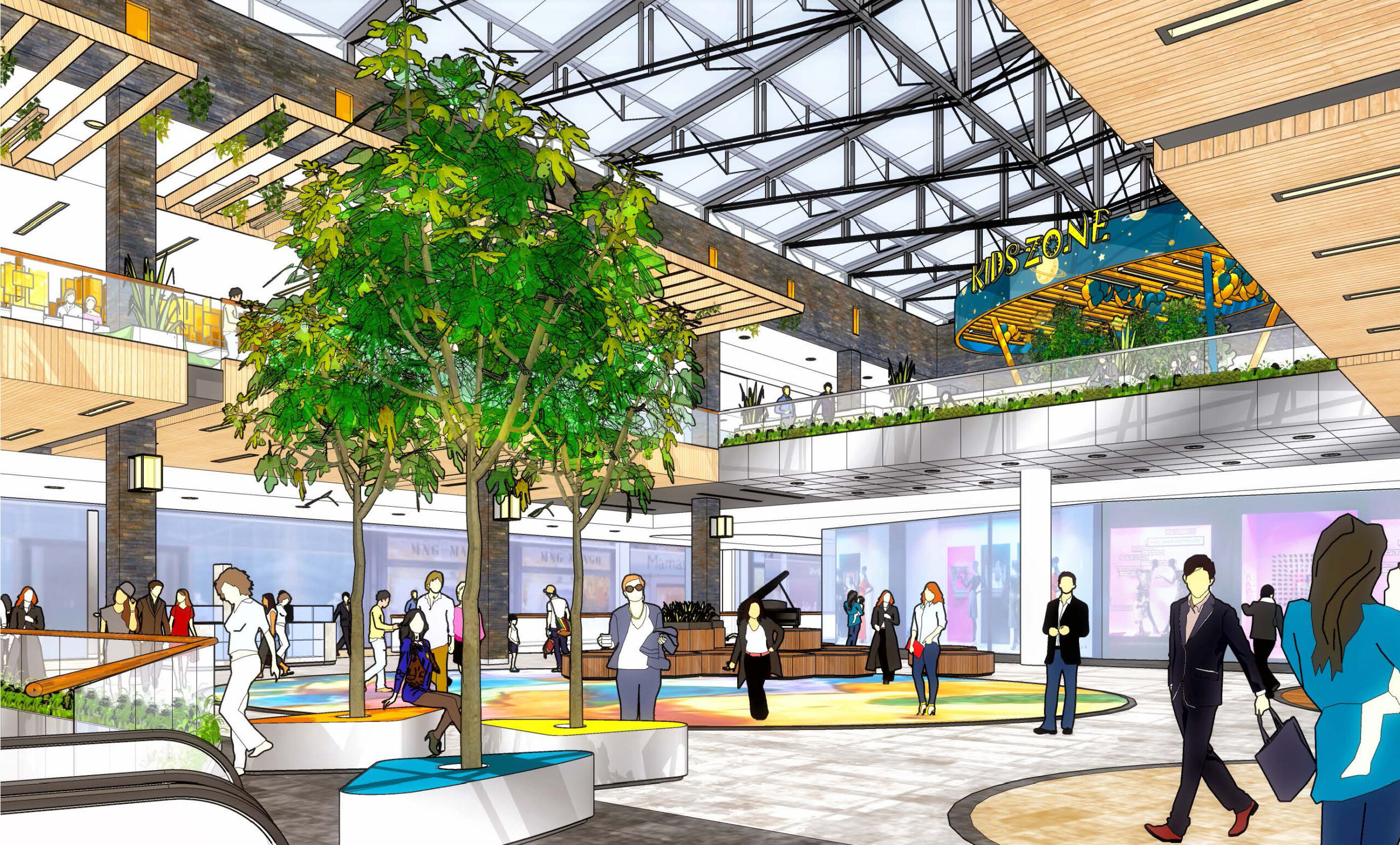
The large central area is of course needed to accommodate events which attract people to the mall. It also contributes to the orientation of the visitors in the retail scheme. This a gathering place where visitors can hang around and chat; very much like the public seats in a French park.
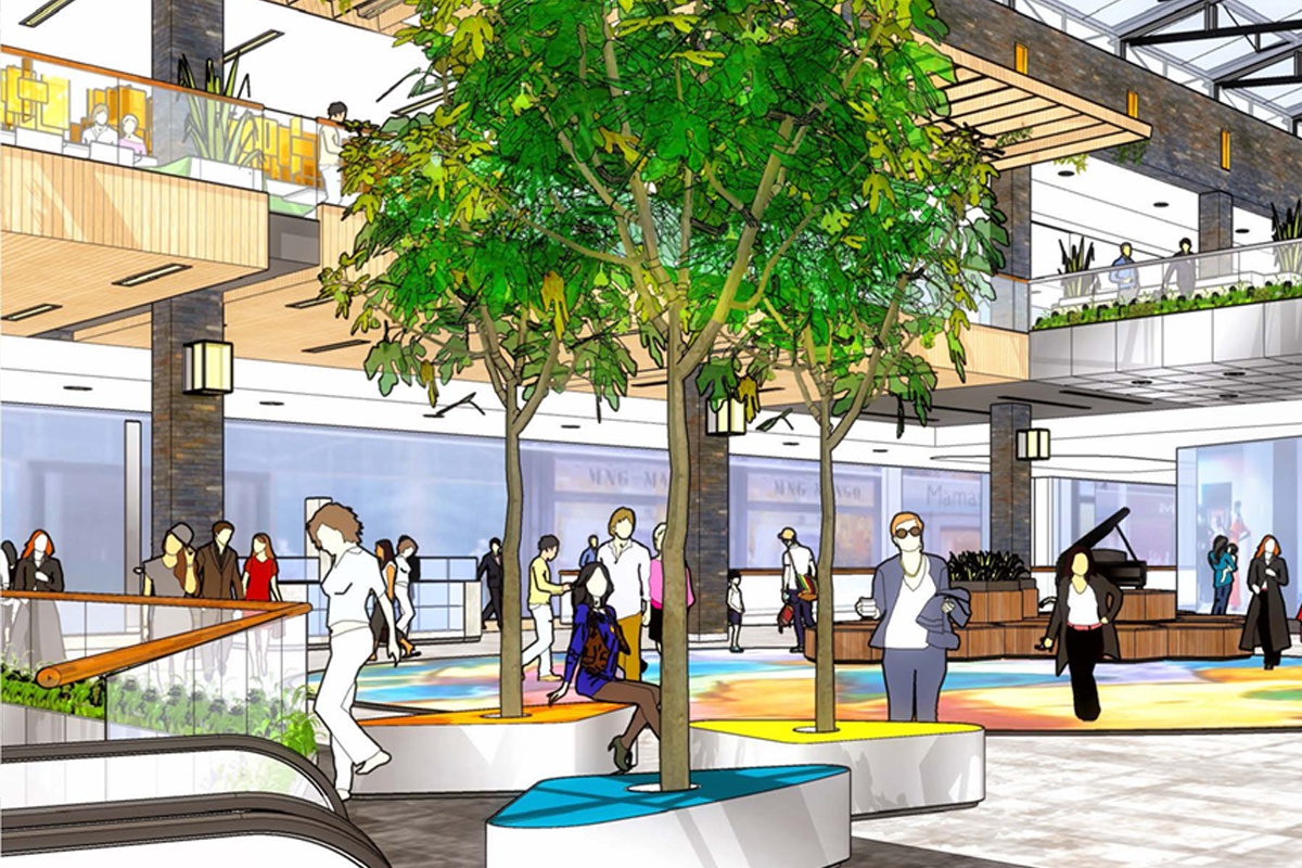
We always use a lot of greenery in our mall concepts. People experience plants and greenery as pleasant and fresh, and it adds a welcoming, natural aspect to the stone and glass of the shopfronts. Merging it into the design and good maintenance are required conditions. We are big fans of large trees in a mall; as they help to scale the space, connect different levels and create a seating spot.
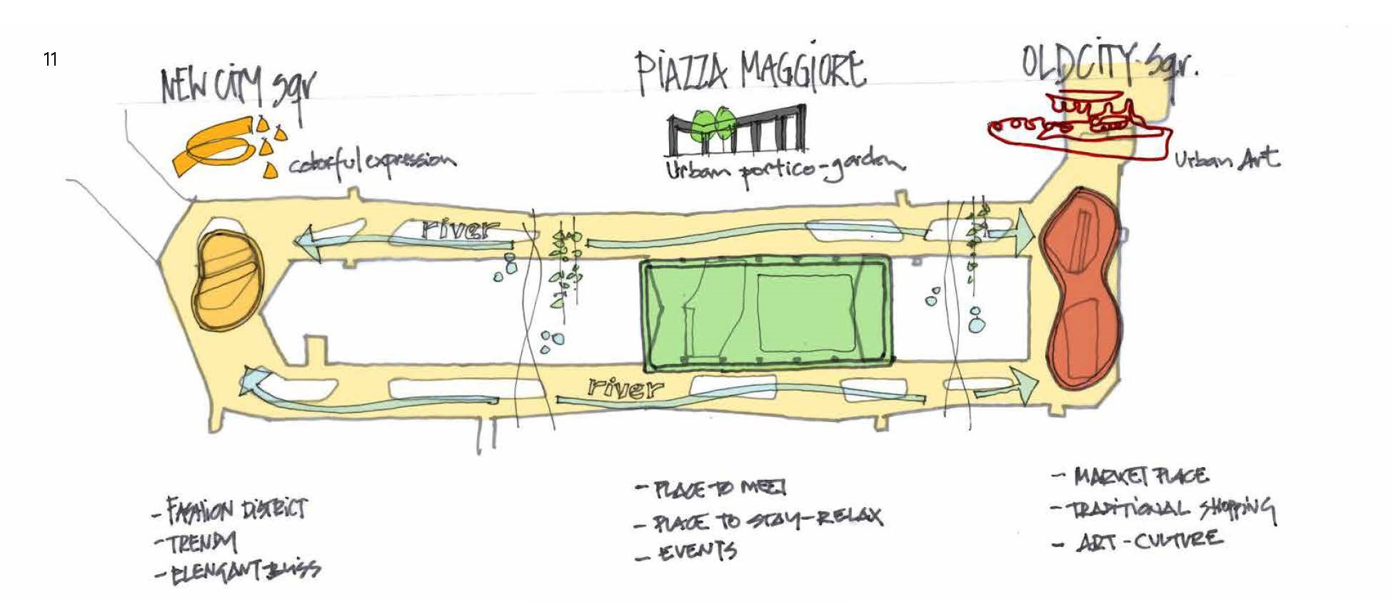
Concept
What were your particular objectives and challenges with the design?
Redesigning some of the interior spaces of a shopping centre during construction is always an intense challenge, certainly when you want to adjust the structure of the building to implement a central space. You have to stop the building process and coordinate all disciplines again. In all our years of designing shopping centres as an architectural team we have never experienced this before. It was a very brave decision of the client to bring a central heart to the project.
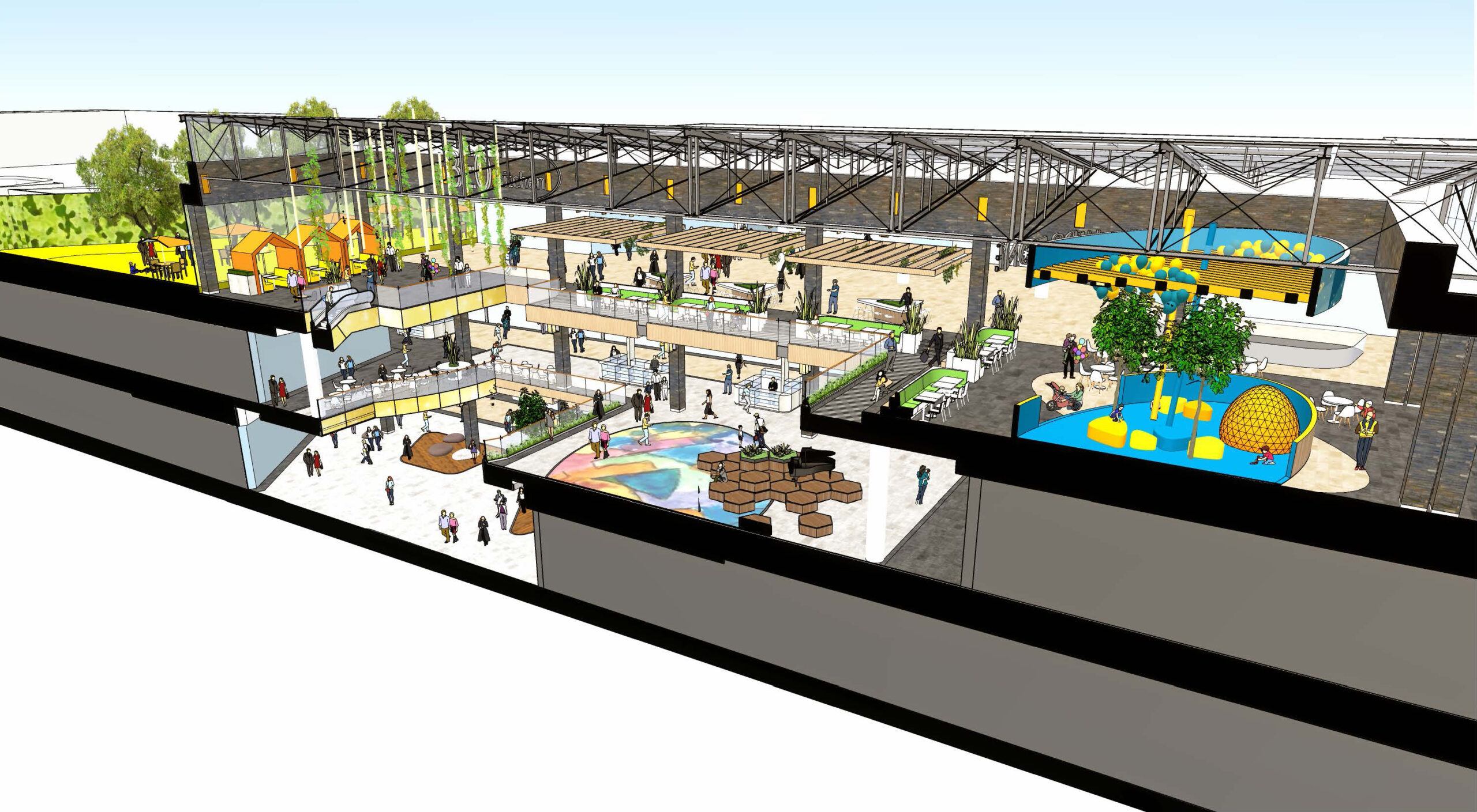
Section Impression
In terms of design, which parts do you consider to be the highlights?
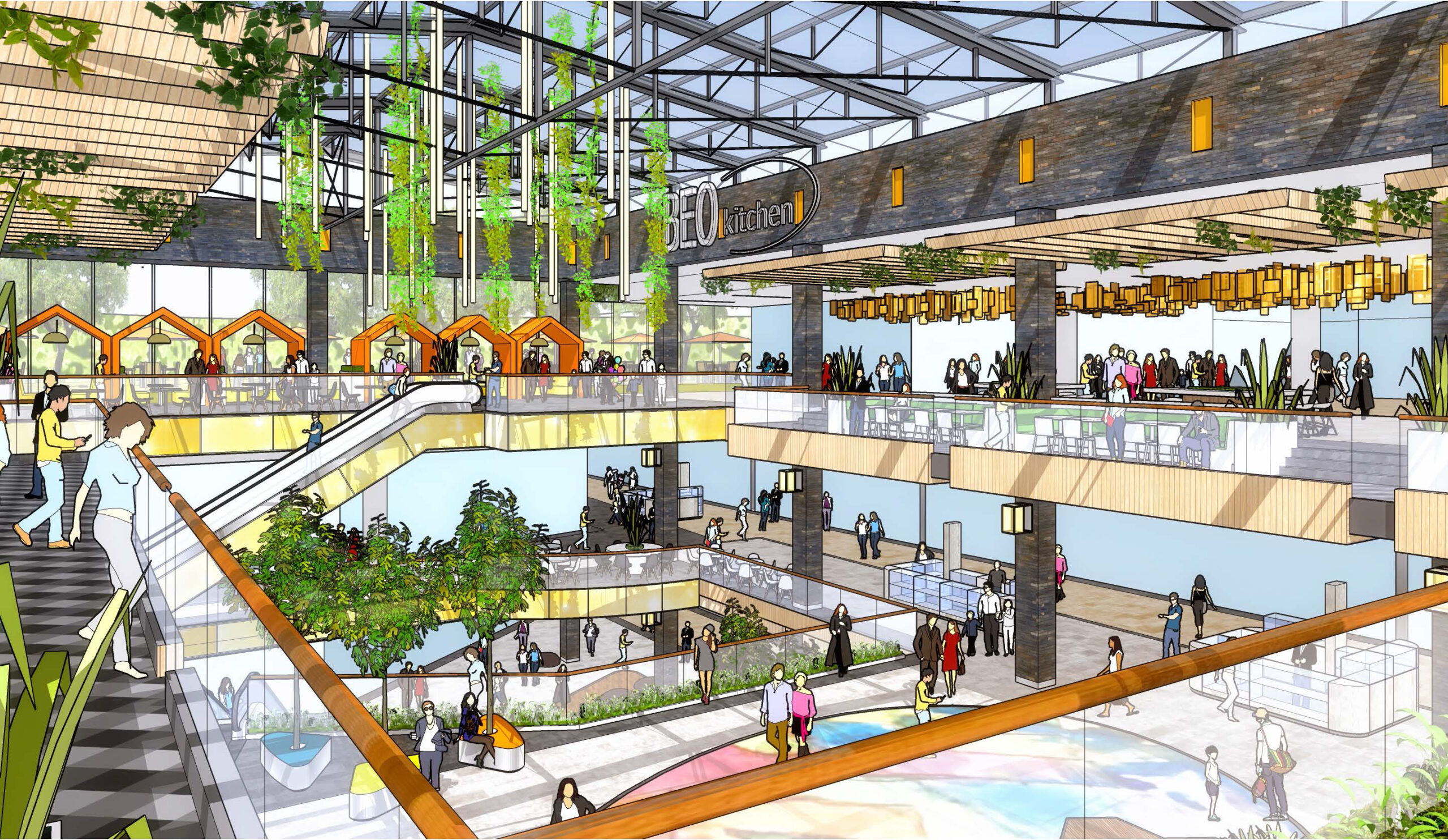
We are very satisfied with the sequence of squares and the linear mall spaces. So, the hierarchy of spaces, large and high in contrast to tight and low, connected over several levels, creates very functional and interesting sightlines. It strengthens the spatial experience in a way that gives you the feeling that there is always something happening.
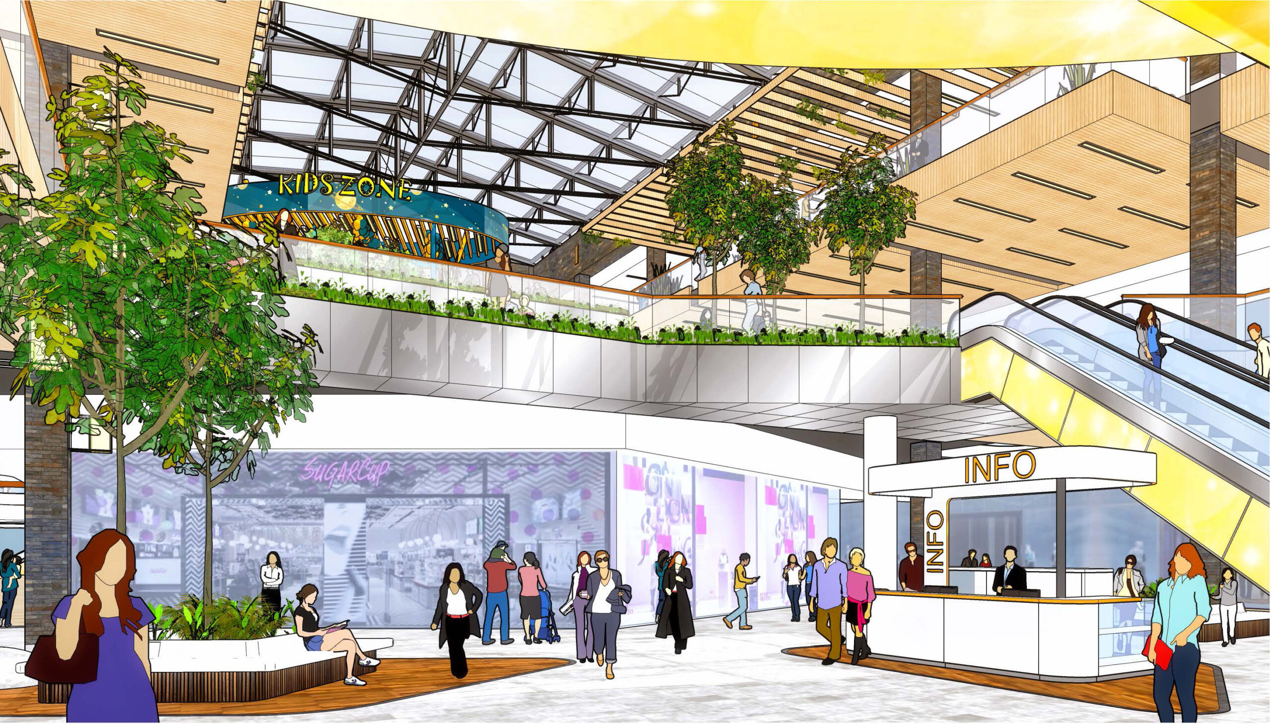
Level 0 Impression
The particular location in Belgrade must have informed some of your decisions; can you tell us about that?
What we had in mind from the beginning was to get local artists involved in the scheme to help us to infuse a local flavour into the shopping experience. After a competition the most attractive proposals were chosen for application against walls and ceiling. It was a very successful exercise that resulted in beautiful spaces, each with their own identity.
We think in the Serbian climate the outdoor terraces with their greenery, and water and lighting features are an absolute must. In spring, summer and early autumn they’ll be a major drawcard with all the diverse offerings of drinks and food with outdoor seating and playgrounds for children. Although the available space on the top floor was limited, we were able to create a very attractive and pleasant outdoor space that is accessible throughout the year.
Level 1
Do you think the Covid-19 pandemic will have a lasting effect on the design of public spaces going forward?
The consequences of Covid-19 are currently a disaster for meeting places in the public realm and in shopping centres. There is this contradiction of people who want to socialise and at the same time keep a safe distance. It doesn’t make life easy.
It is our task as architects and that of the landlords to always provide our customers with a safe environment. So, when it is needed, we have to adjust the places. This will continue until the moment people are able to deal with the consequences of this new reality.
Currently, our experience is that the footfall in malls and food courts is on a level that does not jeopardise safety. In the meantime, everybody is waiting for the vaccine and better times.
Level 2

